Corporate Identity System · 2026
Yohaku
is the identity.
The brand system for 言文字. Not a decoration manual. Rules so logo, color, and type say the same thing on every surface.
Yohaku · The Philosophy
Yohaku is the undrawn space in a composition. It is not unfinished, nor leftover. It holds the same weight as the mark it frames.
True yohaku doesn’t read as “empty.” It reads as a brand that knows exactly what it wants to say — and so needn’t say much.
Naming · Brand Naming
Fixed writing. Chinese uses full-width 「|」; English uses a hyphenated form.
The whole hub uses this Chinese name; sub-brands never replace the parent brand. Separator: full-width 「|」.
The whole hub uses this English name. The word emoji means the expressive symbol: what gives text its warmth. Sub-brands, fixed spelling: 在咖啡(at cafe)、三點水(3AM)、等等空間(Stay Square).
Same full-width 「|」. English formal name may appear alongside.
Hub first: keep talent density beside Taipei Main Station, where words and people meet. 1F serves light meals and coffee by day and turns into a late-night eatery after dark; 2F, 3F and the support floors are shared space for members.
The Chinese master line is fixed for all external use; do not drop 「你」, reorder the clauses, or remove the final full stop.
Logo
The mark is fixed. Never distort, recolour, decorate, rotate, crowd, or place it on a restless ground. Primary lockup: 言文字|台灣人才聚落. Favicon: the single character「言」, transparent background, ink #1B1A17. On ink grounds use the reverse (paper) files.

Clear space
Keep at least about one-quarter of the character height as empty margin around the mark. Crowding the logo crowds the brand voice.
Do not
Color
Ink and paper form the neutral spine. Yellow is the only accent: at most one hit per view, always as a background, with ink on top.
One hit of yellow is enough
#FFDE34 is a highlight, never a wash: underline swash, badge, or text selection. Ink always sits on yellow. One small hit per view.
Typography
Ming-style display, classical Latin serif, sans for body. Keep each role distinct.
Checklist
Check before publish. Compliance over flourish.
- Does yellow appear only once?
- Is yellow a background, with ink on top?
- Is the logo at original proportion and color? (reverse files on ink grounds)
- Is the primary lockup the talent hub (not the old Cafe & Bar)?
- Does the mobile layout still keep yohaku?
- Are headlines in serif and body in sans?
- Is the tone short, plain, without exclamation?
- Is the name separator full-width 「|」?
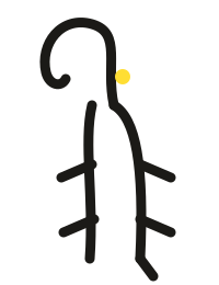
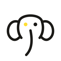
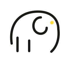
- moji: three elements and one yellow dot only?
Downloads
Use assets under these rules. For partnerships or custom edits, email us.
Press & partners: us@emoji.tw
Character · moji
The elephant of emoji. The elephant was the first emoji: the oracle-bone character for 象 is a drawing of one. One name only, lowercase moji. Same stroke, same single yellow dot.

States · Three floors
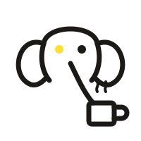
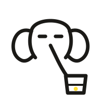
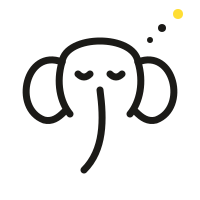

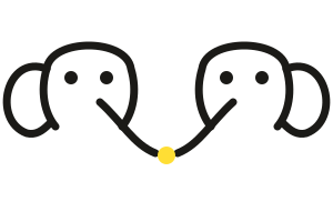
Character tagline: words become worlds. It does not replace the main slogan. moji is the building's earliest regular, not a mascot.